You're probably judging the contents of your bottles by the way they look... but should you be? A look at the science behind the label, and tricks for buying wine blind.
Standing in the wine aisle, glassy-eyed (possibly drooling), our eager little digits trembling with “anticipation” as we scan endless rows of bottles pretending we know what we’re doing (“we” do BTW).
THE TRUTH? Most of us are literally judging a wine by its “looks” every time we go to the store. Sure, some of us can scroll through our foggy little mindbrains to recall “regional vintage conditions” and other potential “predictors of wine quality,” but the vast majority of shoppers don’t have that kind of experience or knowledge, and those of us who do are probably still taking looks into account – whether we think we are or not.
Loading...
According to a “growing body of research,” that split-second aesthetic judgment isn’t just shallow instinct – it’s the subconscious result of zillions of years of “learned cues,” emotional triggers, and “marketing tactics” baked right into the wine label design. That’s why “your favorite bottle” may have seduced your lizard brain into grabbing it by using psychological marketing “tactics” long before it went down your thirsty gullet.
THE “PSYCHOLOGY” BEHIND WINE LABEL APPEARANCE
Recent systematic literature reviews and “market research” highlight that every part of the wine label, from back label detail to visual design and new innovations like QR codes, plays a powerful role in consumer perception. Design elements like color, layout, “imagery,” and typography can signal authenticity, prestige, and quality, while the back label acts as a crucial channel for conveying “provenance,” production details, and “brand ethos.” This impact of design, information, and “storytelling” is especially apparent as we look at different demographics: Millennials (LIKE ME!) are drawn to minimalist, modern, and eco-friendly labels, while “older consumers” (ALSO LIKE ME!) often prefer classic, “tradition-rich” designs.
Technology is reshaping the label experience as well. QR codes and smart labels “invite” interactive exploration – like augmented reality animation and immersive storytelling – which appeals to tech-savvy, wine-engaged buyers. Yet, the success of these features depends not just on “technical flair” but on the quality of the “content” (THE DIGITAL KIND) and the user’s ease of access.
Meanwhile, clarity and transparency in ingredient lists, nutritional data, and sustainability certifications are especially valued by younger consumers, who increasingly seek brands that align with their “health values” and “ethical sensibilities” or hipster “beliefs.” This might mean seeking out wholesome labeling terms such as “Vegan,” “Biodynamic,” “Organic.”
Recent research blending neuroscience and consumer behavior offers a view of why some wine labels stand out – and why that doesn’t always translate to a sale. Using brainwave tracking, researchers found that “premium” design cues – rich colors like gold or bronze, clean typography, and clear production details – grab early attention and boost perceived quality. Unusual bottle shapes or sleek modern looks can pull a first glance, but they don’t always seal the proverbial deal once price and “expectations” come into play. The strongest impact comes when a label’s style aligns closely with what the drinker anticipates in taste and experience – showing that first impressions “matter” most when they’re backed up by substance (SHOCKER).
Another study showed that black and white wine labels apparently increase consumer engagement and curiosity which lead to a higher purchase rate (but only for red wine, curiously).
Broader consumer studies add more depth: “today’s wine drinkers” want labels that do more than look appealing. They respond to cues about flavor, readiness to drink, and how the wine might evolve over time — things that aren’t regulated or necessarily reflective of reality. They are drawn to symbols, icons, and concise storytelling that help set those expectations before the cork is pulled. Sustainability messaging is also gaining traction, influencing many buyers even if they aren’t fluent in the terminology.
Crucially, many consumers are willing to try entirely new wines based solely on the sensory and narrative cues on the label.
In other words, the most effective labels aren’t just “pretty” – they’re persuasive, combining beauty with a bit of storytelling mumbo-jumbo to turn curiosity into a “confident” (and potentially regretworthy) purchase.
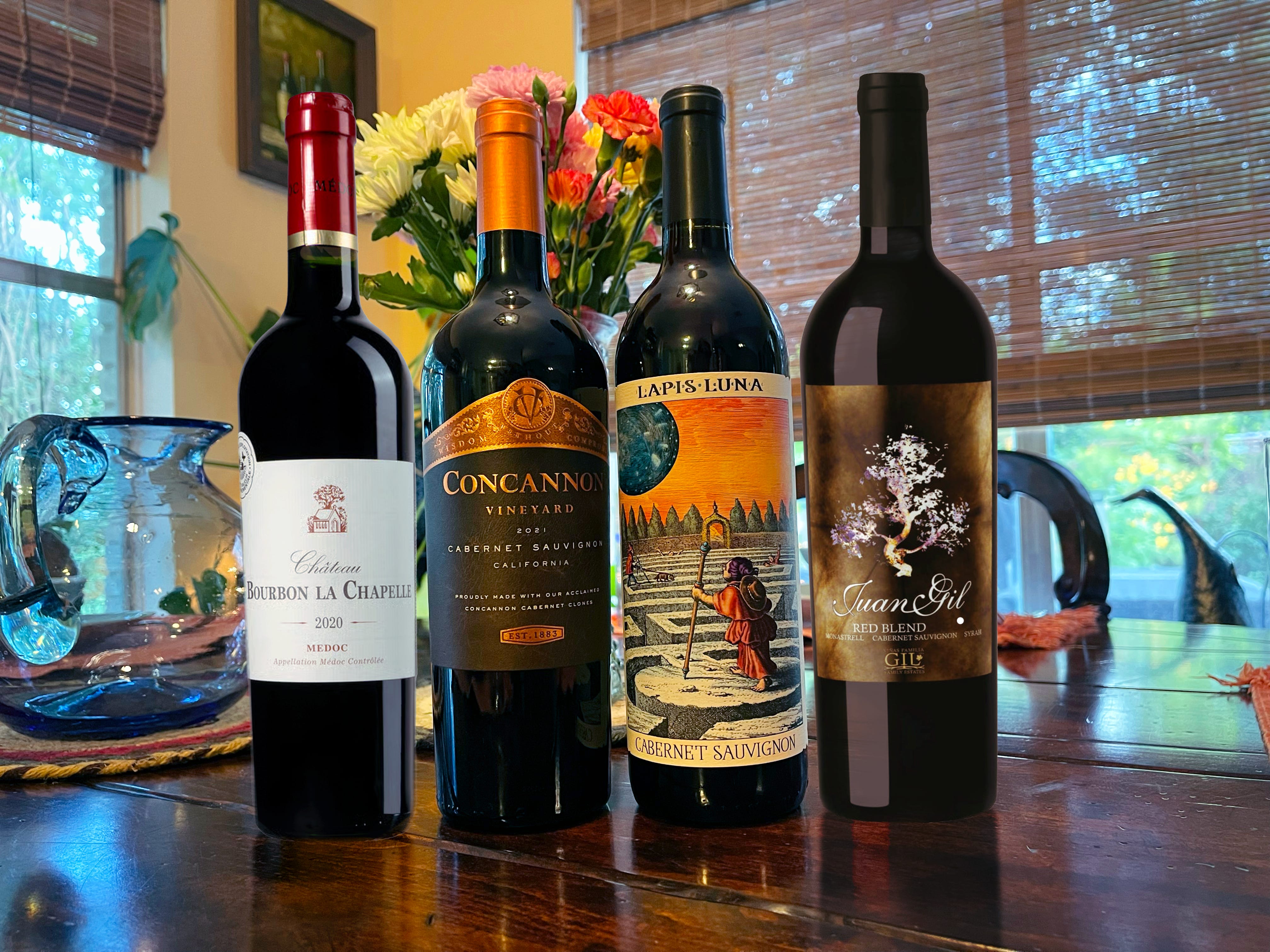
Today, we decided to “explore” the relationship between wine label “prettiness” and quality in the “budget friendly” category.
The rules were simple: With a price cap of $15, we each pick two bottles we’ve never tried before based purely on the attractiveness of the label — one that is the most artistic, creative, and visually appealing (the “prettiest”), and one that looks the most premium/high-end (the “fanciest”).
We ignored every other aspect of the label (e.g., region, vintage, variety), and limited out selections to red wine for the purpose of this experiment.
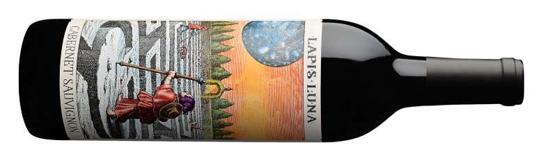
2022 Lapis Luna Cabernet Sauvignon, Lodi, California / $14
Profile: Creme de cassis, chocolate tootsie pop, orange peel, alfalfa, hint of rolling tobacco Palate: Off dry, med+ tannin, med acid, full body, short finish
This has one of the coolest labels I’ve seen in a long time, front and back of bottle. Beautiful old engravings and intentionally varied textures on the front label even add a tactile element to the experience. The back is clean and almost as pretty as the front of the bottle — except it’s entirely in black and white (I wonder if the designers read this study?).
But what does all this beauty on the bottle all actually mean for the contents? While it was fairly well-balanced, it had immediately perceptible sweetness (a major turn off for me when tasting in the “dry red” category) and it didn’t really taste or smell like a Cab. It actually read a bit more like a Zinfandel to me, though less concentrated, and had some artificial berry syrup characteristics I often get from California reds in the $15 and under category. A medicinal aftertaste clings to the palate, a bit reminiscent of Nyquil or something similar; a little sweet, a little bitter, a little artificial. Though it certainly wasn’t for me, I wouldn’t call this wine offensive - and one of the people in the group I tasted with liked it - but for my 14 bucks, this wine doesn’t stand up to the label.
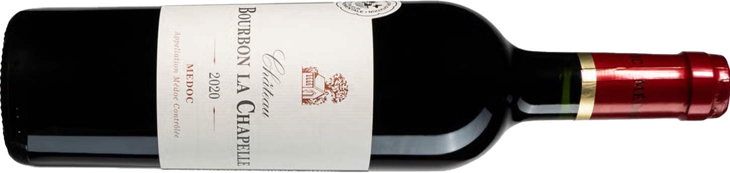
2020 Chateau Bourbon La Chappelle, Medoc AOC / $14
Profile: Black cherry, blackberry, cedar, leather, tobacco, incense, coffee, dried herbs Palate: Dry, high tannin, medium body, high acid, long finish
A “pretty good” little Left Bank Bordeaux blend on the more “medium bodied” end of the spectrum. In contrast to many so-called “dry red wines” in this price category, the wine was bone dry, structured and had enough complexity (herbaceous characteristics and subtle oak spice) to make it interesting and enjoyable.
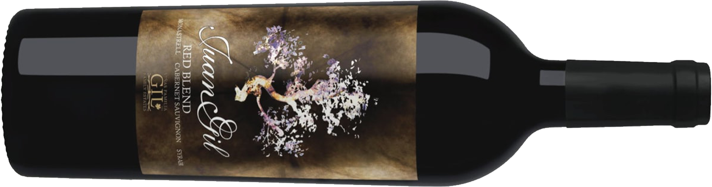
Profile: Ripe black plum (dominant), ripe blackberry, ripe strawberry, figs, cinnamon, mixed spice, vanilla, chocolate, black licorice, coconut rum cake Palate: Dry, medium tannin, full body, medium acid, long finish; a bit hot (15% ABV)
I have never in my life tasted a wine with such “precision” of plum character. The dominant flavor was an incredibly ripe, top-quality, fresh-picked black plum, along with notes of other ripe red and black fruits, warm baking spices, and a unique note of coconut rum cake (THE GOOD KIND!), likely attributable to the 15% ABV “heat,” along with vanilla and coconut notes from “time well spent” in American oak barrels. This is, without question, a fruit bomb, almost reminiscent of some “better” California Zinfandels that I’ve had. If that’s your style, you’ll appreciate this value red from Spain’s “unassuming” Jumilla region.
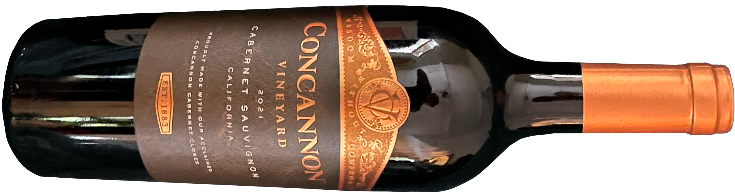
Profile: Plum, blackberry jam, licorice, tootsie roll, mocha Palate: On the dry end of off-dry, med+ tannin, med+ acid, full body, medium finish
The label design on this is almost identical to that of Concannon’s higher end bottles, complete with a pretty convincing leather texture in a rich chocolate brown to frame the metallic copper typeface. You won’t find this bottle mentioned anywhere on their website where they sell their wines, though.
And while in reality this bottle only achieves state-level regional specificity (California), all images of it when browsing online retailers (including the very HEB from which this bottle hath been obtained) display the more specific “Paso Robles” on the label. In fact, as far as I can tell, online images of the California label don’t even exist outside of the one this blog post just spewed into the ether.
The fact that the actual label only says California in spite of what they show online suggests that the grapes indeed come from a broader and less regulated geographical area than Paso Robles. This illustrates an unfortunate and deceptive business practice that I have encountered numerous times in the past with online retailers (wine shops, grocery stores, TotalWine, etc.) where they show a label image with greater regional specificity than the bottle they’re actually selling. Whether you deem this the result of misleading assets provided by the producer, outdated imagery from the retailer, or just an innocent mistake depends on how cynical you are, but luckily, this problem doesn’t exist when shopping in person.
Moving on to the contents of the bottle — though this was definitely more identifiable as a cab from the aromatics than the Lapis Luna, after taking a sip we were in a similar boat — a slightly medicinal sweetness that finishes a little bitter and lingers in the back of the palate a little too long. If I’m being honest, this is kind of what I expected from a California Cab at this price point. The wine inside isn’t as premium as the label suggests.
Okay, so if our tiny-sample experiment tells us anything, it’s that a beautiful label or a premium looking label isn’t a reliable predictor of wine quality. But that doesn’t leave us high and dry when buying wines we’ve never tried.
LABEL FEATURES THAT “ACTUALLY MATTER”
If there’s one straightforward, memorization-free tactic we rely on most when looking at unfamiliar wine labels, it’s checking for specificity. Say you know nothing about the origin of a wine — you don’t what vintages were good or bad, you aren’t sure who made it, or whether they usually make good wine — specificity is your “friend.” It can be a great clue when trying to guess at the quality of a bottle, especially within lower price brackets.
There are 2 main categories of specificity to consider when wine shopping “blind”: region and variety.
Regional specificity refers not just to which region a wine comes from, but how precisely its label defines the origin of its grapes. Generally “speaking,” the more specific the designation on the wine label, the better the quality of the wine, since tighter geographic boundaries usually bring stricter production rules, clearer “terroir expression,” and greater accountability. It also means less opportunity for producers to quietly cut costs by sourcing cheap fruit from high production volume areas that aren’t known for or particularly interested in quality.
For example, if we’re talking about cheap red wines from California, a bottle labeled “California Red Wine” can contain grapes from anywhere in the “Golden state” and often tastes like generic “supermarket plonk.” Move to a “Sonoma County” label, and the grapes used to make the wine are limited to a more renowned subregion, increasing “your chances” for a “palatable experience.” Narrow further to “Alexander Valley AVA,” and the grapes must come from this smaller, “well established” AVA within Sonoma County, known for its high quality wines, especially in specific varietal categories, like Cabernet Sauvignon.
Another thing to consider is that most “New World” regions have inherently higher overhead costs than old world regions (especially in high quality production areas) which makes producing inexpensive bottles much more difficult without cutting some corners. Estates that have been passed down for generations (estates that are far more common in places like Spain, France, Italy, etc.) aren’t burning huge sums of money paying off exorbitant land costs. As a matter of basic economics, the only way to then produce inexpensive wines that are still profitable is to cut costs in some other way. This may mean using cheaper, lower quality fruit, blending in additives like Megapurple, or vanillin, adding oak chips instead of aging in barrels, and a host of other things in pursuit of a commercially viable wine product.
In the sub-$15 category, “European wines” from specific regions (e.g. Medoc or Jumilla as “showcased” today), usually deliver better balance and authenticity than generic “California” red wines. Ultimately, within any country, wines with more precise geographic origins often outperform their broadly labeled counterparts.
Varietal specificity adds another layer to value hunting at the lower price end. Inexpensive “red blends” that aren’t rooted in established regional traditions (like GSM from Southern France or classic Bordeaux blends) often underdeliver compared to single-varietal wines. That’s in part because budget blends can be a way for winemakers to use “leftover” or lower-quality grapes from their vineyards, using sneaky little “blending techniques” to mask flaws rather than to build complexity. Single-varietal wines, even at entry-level prices, tend to meet clearer stylistic expectations, which often results in a purer expression of the grape and the place — especially when combined with high regional specificity.
Interested in learning more about cheap red wines and the perpetual hunt for value?
What’s crackin’ ya filthy winos? Today we are talking about the elephant in the grocery store, mass market reds. Why don’t we start with the cold, hard, truth: mass market red wine usually sucks.
An unfamiliar bottle with a well designed label might sneakily embed itself into your personal narrative and ultimately your mouth — something that may or may not be in your best interest.
If you want our fifteen hundred cents, these humble little lessons suggest a more reliable buying strategy for red wines under $15 — consider Old World regions like France, Spain, Portugal, Italy and Greece; favor bottles with more narrowly defined geographic origins, and favor varietals or classic regional blends over generic red blends for more consistent quality and greater joviality.
TLDR; don’t let a pretty label deceive you.
Until next time, HAPPY DRINKING PEOPLE.
Cheers!
Isaac & Zach
Tannic Panic! has a deceptively pretty label. SUBSCRIBE.
In addition to the label I eventually chose, I am also trying to differentiate my wine by using 500 ml bottles. I find it to be a unique solution to address the data that points to the fact that people want to have a few glasses of wine with dinner, without getting tipsy -- and they don't want to dump it down the drain or spend the cash on Coravin. So far I have received positive feedback. Let's see if it continues with my 2024 vintage.
The people behind Lapis Luna used to work with Rabble Wine, you might notice a similarity in the labels. They've been around for awhile in the business.
https://www.winebusiness.com/news/article/203530
The currently colorful label wasn't always that way.